World Happiness Report makes statisticians unhappy
Apr 25, 2012 02:16 am • Permalink 
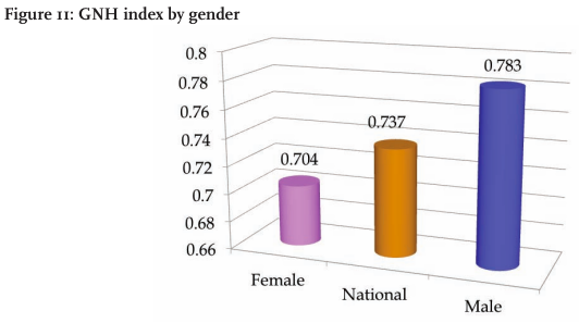
It feels oh so wrong posting about bad charts in a report about happiness around the world, but here you go. I do it for you. The first World Happiness Report was released by the United Nations earlier this month. It's filled with gems like the 3-d bar chart above. Notice the axis that starts at 0.66. (You shouldn't do that because length is the visual cue here, and it makes the differences look greater than they actually are.)
There are also a few of these bad boys.

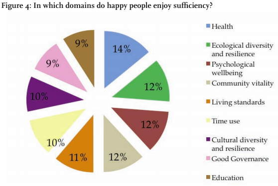
Kaiser Fung has a go at the exploding pie charts:
I'm really curious how these domains add up to 100% exactly. Since the data came from some kind of survey, you typically would allow each respondent to pick more than one domains in which he or she is happy. If that is the case, then it would not make sense to add up responses, nor would the total (100%) signify anything.
If, on the other hand, respondents are forced to pick only one domain, it is very suspicious that all 9 domains would essentially receive the same number of votes. Nor would it make sense to ask survey-takers to select only one domain if all 9 domains contribute to someone's happiness.
And someone please get Andrew Gelman a barf bag before he makes another mess.

Learning data visualization
Apr 25, 2012 12:28 am • Permalink  I listen to a lot of podcasts. They make my workouts much more enjoyable. For the most part though, I only listen to ones about sports and more general podcasts about design, technology, and working from home. However, a couple of months ago, Enrico Bertini and Moritz Stefaner started Data Stories, a podcast on visualization. Enrico is a researcher in the area and Moritz is more of a practitioner, so it's a good contrast between the two.
Neither had experience producing podcasts before this, so it was rough around the edges at first. But each episode has been getting better. I highly recommend it.
In the most recent episode, with Andy Kirk, they discuss the most common question from people new to the field: how to get started. Go ahead and listen. It's a good one if you're itching to get your feet wet.
One thing I'd add (that maybe I missed as cars drove past me) is that it's important to establish what you want to learn visualization for. The purpose will change what methods to use and what software to learn. Monitoring server load for a web service is going to be different than say, designing an atlas.

Urban datasexual
Apr 24, 2012 08:23 am • Permalink Dominic Basulto parallels the urban metrosexual to those who collect personal data.
The same cultural zeitgeist that gave us the metrosexual - the urban male obsessive about grooming and personal appearance - is also creating its digital equivalent: the datasexual. The datasexual looks a lot like you and me, but what's different is their preoccupation with personal data. They are relentlessly digital, they obsessively record everything about their personal lives, and they think that data is sexy. In fact, the bigger the data, the sexier it becomes. Their lives — from a data perspective, at least — are perfectly groomed.
The difference is that metrosexuals spend their time accentuating their best features and hiding their flaws, whereas personal data collectors spend their time at Quantified Self meetups telling others the weird and interesting things they found.


 I listen to a lot of podcasts. They make my workouts much more enjoyable. For the most part though, I only listen to ones about sports and more general podcasts about design, technology, and working from home. However, a couple of months ago,
No comments:
Post a Comment